PitchYour Game

22 September 2026 · Brand, product and application

DesignLanguage

Black and warm greys. Wide typography. Lime as a focused signal. Rising and connecting through sport shape Pitch Your Game — in the app, on the website and in marketing.

App icon
Pitch Your Game wordmark
Brand mark in neon
01 — Foundation

One brand.
Clear sources.

Pitch Your Game is a social network across sports. People share their game, discover relevant contacts and start conversations. Football is one use case; the brand belongs to sport.

Colours, typography and components have been checked against the current iOS code. Images show exported example components, not real user profiles or complete app screens. Their version is distinct from the beta release available to users.

This guide is maintained editorially. Brand export updates colour tokens and image files; copy, roles, navigation and downloads need a separate review.

02 — Wordmark

Pitch large,
Your Game beneath

The brand is called Pitch Your Game — always the full name in public. “Pitch” on its own has little distinctive character as a wordmark and must never be a public logo. In running text “Pitch” is fine as a short form once the full name has appeared.

Stacked wordmark: PITCH above YOUR GAME
Stacked — the primary lockupUsed in the feed header. “PITCH” carries it, “YOUR GAME” sits flush beneath. The second line deliberately uses a softer, rounded cut — that takes the hardness out of the wide tracking and makes both lines read as one unit.
Single-line wordmark with mark
Single line — with the markFor sign-in, onboarding and narrow bars where height is short. Mark left, name right, spaced by half a mark width.
App icon
Mark onlyBelow roughly 90 px wide. App icon, profile picture, avatar, favicon — the same file everywhere.
Do

First mention always in full — headline, bio, legal notice, App Store, post copy.

Keep the tracking. The wide letter spacing is the character, not an effect.

The Pitch card keeps its name. It is a feature, not a brand.

Never

No “PITCH” alone as a public logo.

Not “PitchYourGame” or “Pitch‑Your‑Game”. Three words, ordinary spaces.

No lowercase like “Pitch your game”, and never break the second line.

03 — The mark

Three rising chevrons

The mark is a movement, not a symbol: three angles, stacked, strong at the top, fading downward. It means rising — and it is the one element that works at every size, from an 11‑pixel bullet to the app icon.

Mark in ink on neon
Ink on neonThe app icon. Also the profile picture on every social network — no other variant anywhere.
Mark in neon
Neon on blackThe standard version. Stepped opacity — the gradient is the upward movement.
Mark in white
WhiteWhen neon will not work — on a colour photo, in print, in black and white.

The measurements

Expressed as a share of the span so they hold at any size. Measured pixel‑exactly from the app icon.

PropertyValueWhy
Span1.000Reference, cap centre to cap centre
Arm slope0.80038.66° — shallow. Steeper reads as a play button
Stroke weight0.196Round caps, never tapered
Row spacing0.400The angles never touch
Opacity1.0 / 0.7 / 0.4Strong at the top, fading downward
Do

Always upward. Motion runs bottom to top through the three angles.

One colour. The stepping comes from opacity, never a second colour.

Clear space of at least half a mark height all round.

Three chevrons mean the brand, a single chevron means a bullet point.

Never

Never mirror, never rotate, never point it down. A mark pointing down says the opposite.

No gradient, no shadow, no outline on the mark itself.

Not a navigation arrow. Back, next and scroll use neutral system symbols. The rating button explicitly uses the brand mark.

04 — Colour

One neon,
warm neutrals

Pitch Your Game has one colour. Everything else is black, white and warm grey. The neutrals carry a deliberate yellow bias — blue‑tinted grey plus yellow‑green neon gives the gaming look, and that reads cheap. Sports brands set the same neon on warm neutrals.
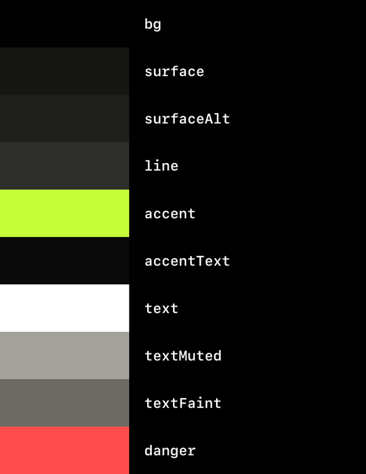
Ground
#000000
True OLED black, everywhere
Surface
#151513
Cards, lists, panels
Raised
#1F1F1C
Inputs, segments
Line
#2E2E2A
Dividers, borders
Neon
#C6FF3A
The signature
Ink
#0A0A0A
Text on neon
Text
#FFFFFF
Names, titles, primary button
Muted
#A3A29B
Meta, inactive icons
Faint
#6B6A63
Subtle details; check contrast
Warning
#FF4D4D
Errors, deletion and seeking status
Colour palette rendered by the app
Cross-checkThe same colours, rendered by the app itself. If the strip ever differs from the table, the app is right.
The neon ruleNeon is a signal, not decoration. The mark may always be neon — otherwise one thing per surface at most.
White is the primary action“Get started”, “Continue” and the primary website action. Neon stays with the rating, the shirt number and the mark.
ContrastNeon on black and ink on neon both sit well above AA. Neon on white is unreadable — never do it.
Outside coloursKits and crests in user content are content, not brand. In the picture yes, in the frame never.
05 — Type

Two roles,
no more

Web and marketing: Archivo at width 125, weight 800–900 for large capitals. iOS: the native system font with expanded width for brand headings; system type for controls and body text. The stacked app wordmark uses a rounded second line. These web examples demonstrate hierarchy, not universal app font sizes.

Pitch Your GameDisplay · 900 · 26 · tracking 0.13em
ProfileDisplay · 900 · 29 · tracking 0.06em
10Display · 900 · 31 · shirt number
Marvin NeumannText · 800 · 27 · tracking −0.015em
Central midfieldText · 600 · 20 · values
Share your best moment.Text · 400 · 16 · body
Full-back · 18d agoText · 400 · 15 · muted
StrengthsText · 800 · 11 · tracking 0.22em

Type size follows context and available space. Native app text styles support Dynamic Type; fixed component sizes require separate checks. Scaling is not assumed for every component.

06 — Components

The Pitch card

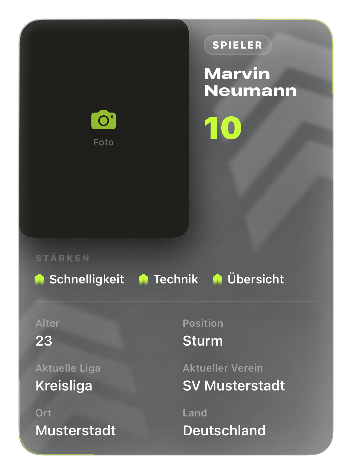
The Pitch card is the signature component for player profiles. Coaches, scouts, clubs and members use an avatar-based profile header. Fields and shirt numbers depend on sport and role.
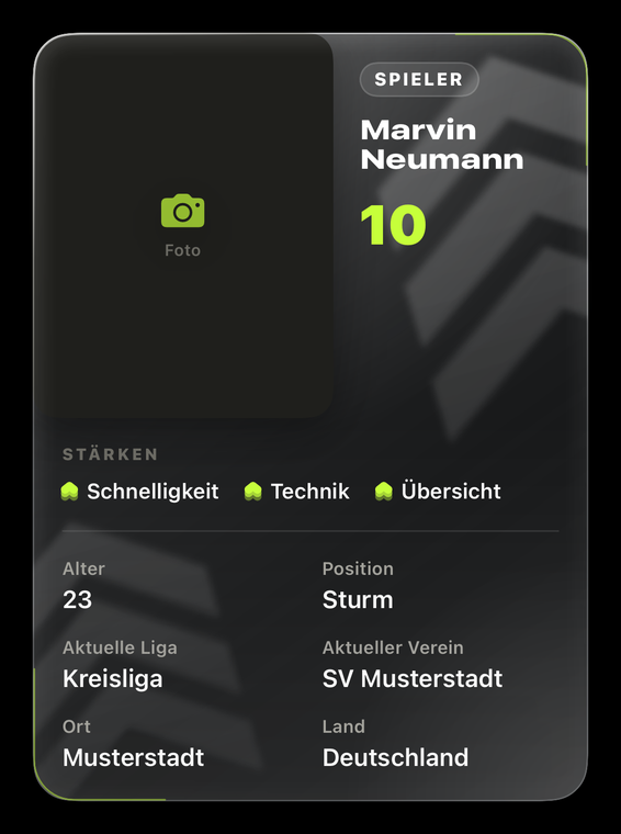
A player’s Pitch card, exported from the app
Current component export · 22 Sep 2026 · Example data
PartRule
Shape24 pt outer radius in the app, softly rounded. Diagonal gradient from warm graphite top left to near black bottom right.
WatermarkSharp wedges, rotated, large, bleeding off the edge. A separate shape family — background embossing only, never small, never as an icon, never in neon.
Edge lightA fine neon arc following the corner radius. Not a continuous frame.
PhotoLeft, just under half the width, portrait.
RoleBeside the photo: a white glass pill, then a left-aligned name and an optional number.
NumberThe only neon on the card besides the strength marks.
FieldsTwo columns, label small and grey above the value.
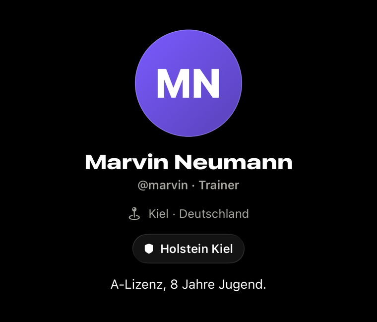
Example coach profile
Profile headers for other rolesAvatar, name and relevant information instead of a player card. Shown: a coach profile. Use “Mitglied” in German and “Member” in English.
Loading screen
Loading screenA wave runs bottom to top through the angles — the same rising gesture, in motion. Never dim below 50 %: the brand lights up, it does not blink.

Feed
Notifications
Messages
Profile

Four native tabsFeed · Notifications · Messages · Profile. Search and publishing are separate feed actions. Use actual captures of the relevant build for app mockups.
Across sportsShow relevant fields and wording. Do not force football positions or shirt numbers onto every sport.
Truthful product visualsAn app screen is a capture of an identified build. Component exports are building blocks, not complete screens.
InteractionNative navigation, sheets, menus and photo picking. Clear loading, empty, error and success states.
MotionUpward motion for the brand; short, immediate feedback for actions. Respect reduced motion and avoid delaying interaction.
07 — Components

The rating

Two different statements, so two forms. Never mix them: the circle is an action, the number is information. Scale 7.0 to 10.0, one decimal.

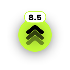
Rating button
RateNeon circle with the mark in ink. Your own rating — a control.
Rating button with a value
Already ratedThe white value pill sits on top of the button.
Average display
AverageMark plus a white number. Display only, not a button. Never a star — the leitmotif is the chevron.

The scale in hand

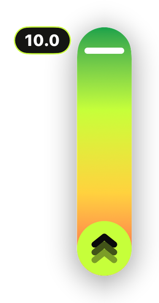
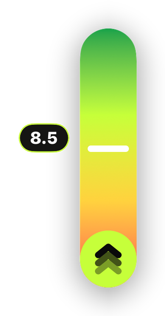
Press and hold the button and the scale unfolds upward. The gradient runs from red at 7.0 through neon to green at 10.0 — the colour tells you how good the rating is before you read the number. The white handle follows your thumb, the value sits to its left and snaps in tenths.
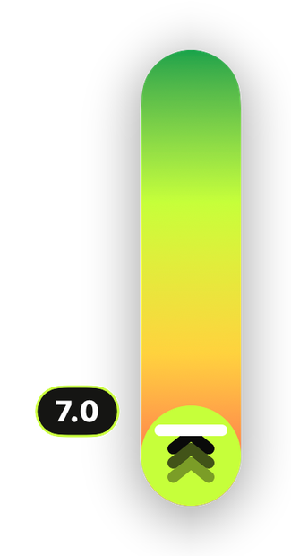
Rating scale at 7.0
7.0 — the floorRed. It goes no lower; there is no bad rating, only a low one.
Rating scale at 8.5
8.5 — the middleThe handle travels and the number rolls rather than blinking.
Rating scale at 10.0
10.0 — the ceilingGreen. The foot of the bar is the same neon circle as the button below, so nothing steps when it unfolds.
08 — Sport & connection

From your game
to a connection.

Our visual language connects real sporting moments with people and a next action. New product components become clear stories for the landing page and marketing.

01 · Show your gameA training moment, a clip, a player profile. Sport takes centre stage. Draft copy: “Show what makes your game yours.”
02 · Discover your peopleSport, region and shared connections give a profile context. Draft copy: “Your sport. People who share it.”
03 · Get involvedA conversation or trial-practice request makes the next step tangible. Draft copy: “Your next step starts with a conversation.”
Product evidence

Shared connections: A quiet “… follows this profile” line adds context. It indicates a connection, not an endorsement.

Trial practice: Show the recipient, purpose and actual request status. After acceptance, details are arranged in chat.

Check the release

New network and request flows: Described here as a design foundation. Check availability against the released build before a campaign; label previews “In development”.

No invented evidence: No artificial follower counts, club endorsements or confirmed appointments. Label example data clearly.

09 — Application

Advertising
and social

What holds here holds outside the product too. A post that breaks the rules damages the brand faster than a good post builds it.

FormatsFeed 1080 × 1350. Story and Reel 1080 × 1920. Square for grid views only.
Safe margin80 px clear at the edges; in Stories 250 px top and bottom.
One accent per visualThe logo may use lime. Add one focus: a rating or one headline word. Unaltered app captures retain their own signals.
SignatureEvery post carries the wordmark or the mark. Never both, never neither.
Profile pictureThe app icon, identical everywhere.
PhotographyReal sporting spaces, real light, real people across sports. No stock images, no glossy studios.
ToneDirect and short. No superlatives, no strings of exclamation marks.
LanguageGerman in the core market, English internationally. Never mixed in one post.
One specific benefitOne situation per visual: show your game, discover relevant people or start a conversation. One clear next action.
Evidence before promisesCurrent app captures and real situations. No invented user counts, ratings, club endorsements or guaranteed career opportunities.
AvailabilityPromote only features and devices available to the intended audience. Label beta access and upcoming features clearly.
Templates, not platform guaranteesSizes and margins are working templates. Check cropping and interface overlays on the destination platform before publishing.
10 — Files

Originals

These files are the originals. Anyone depicting Pitch Your Game uses them — and redraws nothing. Every redraw deviates and becomes a second logo.

Download everythingZIP · 22 Sep 2026
Never

Do not redraw. The mark has exact measurements.

Do not distort. Keep the aspect ratio, never skew it.

Never

Do not recolour. Neon, white or ink. No other colours, no gradients.

Do not combine. No second logo alongside without one mark width of clearance.